I am happy to join with you today in what will go down in history as the greatest demonstration for freedom in the history of our nation.
Five score years ago, a great American, in whose symbolic shadow we stand today, signed the Emancipation Proclamation. This momentous decree came as a great beacon light of hope to millions of Negro slaves who had been seared in the flames of withering injustice. It came as a joyous daybreak to end the long night of their captivity.
But one hundred years later, the Negro still is not free. One hundred years later, the life of the Negro is still sadly crippled by the manacles of segregation and the chains of discrimination. One hundred years later, the Negro lives on a lonely island of poverty in the midst of a vast ocean of material prosperity. One hundred years later, the Negro is still languished in the corners of American society and finds himself an exile in his own land. And so we've come here today to dramatize a shameful condition.
In a sense we've come to our nation's capital to cash a check. When the architects of our republic wrote the magnificent words of the Constitution and the Declaration of Independence, they were signing a promissory note to which every American was to fall heir. This note was a promise that all men, yes, black men as well as white men, would be guaranteed the "unalienable Rights" of "Life, Liberty and the pursuit of Happiness." It is obvious today that America has defaulted on this promissory note, insofar as her citizens of color are concerned. Instead of honoring this sacred obligation, America has given the Negro people a bad check, a check which has come back marked "insufficient funds."
But we refuse to believe that the bank of justice is bankrupt. We refuse to believe that there are insufficient funds in the great vaults of opportunity of this nation. And so, we've come to cash this check, a check that will give us upon demand the riches of freedom and the security of justice.
We have also come to this hallowed spot to remind America of the fierce urgency of Now. This is no time to engage in the luxury of cooling off or to take the tranquilizing drug of gradualism. Now is the time to make real the promises of democracy. Now is the time to rise from the dark and desolate valley of segregation to the sunlit path of racial justice. Now is the time to lift our nation from the quicksands of racial injustice to the solid rock of brotherhood. Now is the time to make justice a reality for all of God's children.
It would be fatal for the nation to overlook the urgency of the moment. This sweltering summer of the Negro's legitimate discontent will not pass until there is an invigorating autumn of freedom and equality. Nineteen sixty-three is not an end, but a beginning. And those who hope that the Negro needed to blow off steam and will now be content will have a rude awakening if the nation returns to business as usual. And there will be neither rest nor tranquility in America until the Negro is granted his citizenship rights. The whirlwinds of revolt will continue to shake the foundations of our nation until the bright day of justice emerges.
But there is something that I must say to my people, who stand on the warm threshold which leads into the palace of justice: In the process of gaining our rightful place, we must not be guilty of wrongful deeds. Let us not seek to satisfy our thirst for freedom by drinking from the cup of bitterness and hatred. We must forever conduct our struggle on the high plane of dignity and discipline. We must not allow our creative protest to degenerate into physical violence. Again and again, we must rise to the majestic heights of meeting physical force with soul force.
The marvelous new militancy which has engulfed the Negro community must not lead us to a distrust of all white people, for many of our white brothers, as evidenced by their presence here today, have come to realize that their destiny is tied up with our destiny. And they have come to realize that their freedom is inextricably bound to our freedom.
We cannot walk alone.
And as we walk, we must make the pledge that we shall always march ahead.
We cannot turn back.
There are those who are asking the devotees of civil rights, "When will you be satisfied?" We can never be satisfied as long as the Negro is the victim of the unspeakable horrors of police brutality. We can never be satisfied as long as our bodies, heavy with the fatigue of travel, cannot gain lodging in the motels of the highways and the hotels of the cities. We cannot be satisfied as long as the negro's basic mobility is from a smaller ghetto to a larger one. We can never be satisfied as long as our children are stripped of their self-hood and robbed of their dignity by signs stating: "For Whites Only." We cannot be satisfied as long as a Negro in Mississippi cannot vote and a Negro in New York believes he has nothing for which to vote. No, no, we are not satisfied, and we will not be satisfied until "justice rolls down like waters, and righteousness like a mighty stream."¹
I am not unmindful that some of you have come here out of great trials and tribulations. Some of you have come fresh from narrow jail cells. And some of you have come from areas where your quest -- quest for freedom left you battered by the storms of persecution and staggered by the winds of police brutality. You have been the veterans of creative suffering. Continue to work with the faith that unearned suffering is redemptive. Go back to Mississippi, go back to Alabama, go back to South Carolina, go back to Georgia, go back to Louisiana, go back to the slums and ghettos of our northern cities, knowing that somehow this situation can and will be changed.
Let us not wallow in the valley of despair, I say to you today, my friends.
And so even though we face the difficulties of today and tomorrow, I still have a dream. It is a dream deeply rooted in the American dream.
I have a dream that one day this nation will rise up and live out the true meaning of its creed: "We hold these truths to be self-evident, that all men are created equal."
I have a dream that one day on the red hills of Georgia, the sons of former slaves and the sons of former slave owners will be able to sit down together at the table of brotherhood.
I have a dream that one day even the state of Mississippi, a state sweltering with the heat of injustice, sweltering with the heat of oppression, will be transformed into an oasis of freedom and justice.
I have a dream that my four little children will one day live in a nation where they will not be judged by the color of their skin but by the content of their character.
I have a dream today!
I have a dream that one day, down in Alabama, with its vicious racists, with its governor having his lips dripping with the words of "interposition" and "nullification" -- one day right there in Alabama little black boys and black girls will be able to join hands with little white boys and white girls as sisters and brothers.
I have a dream today!
I have a dream that one day every valley shall be exalted, and every hill and mountain shall be made low, the rough places will be made plain, and the crooked places will be made straight; "and the glory of the Lord shall be revealed and all flesh shall see it together."2
This is our hope, and this is the faith that I go back to the South with.
With this faith, we will be able to hew out of the mountain of despair a stone of hope. With this faith, we will be able to transform the jangling discords of our nation into a beautiful symphony of brotherhood. With this faith, we will be able to work together, to pray together, to struggle together, to go to jail together, to stand up for freedom together, knowing that we will be free one day.
And this will be the day -- this will be the day when all of God's children will be able to sing with new meaning:
My country 'tis of thee, sweet land of liberty, of thee I sing.
Land where my fathers died, land of the Pilgrim's pride,
From every mountainside, let freedom ring!
And if America is to be a great nation, this must become true.
And so let freedom ring from the prodigious hilltops of New Hampshire.
Let freedom ring from the mighty mountains of New York.
Let freedom ring from the heightening Alleghenies of Pennsylvania.
Let freedom ring from the snow-capped Rockies of Colorado.
Let freedom ring from the curvaceous slopes of California.
But not only that:
Let freedom ring from Stone Mountain of Georgia.
Let freedom ring from Lookout Mountain of Tennessee.
Let freedom ring from every hill and molehill of Mississippi.
From every mountainside, let freedom ring.
And when this happens, when we allow freedom ring, when we let it ring from every village and every hamlet, from every state and every city, we will be able to speed up that day when all of God's children, black men and white men, Jews and Gentiles, Protestants and Catholics, will be able to join hands and sing in the words of the old Negro spiritual:
Free at last! Free at last!
Thank God Almighty, we are free at last!
Sunday, 22 January 2012
Speeches Assignment
BBC channels are increasingly
cross promoting their programme content and for this assignment you will be
producing a TV trailer for a series of radio programmes on Radio 4 called
‘Speeches’, about a selection of great speeches of the 20th Century.
Radio 4 will be running this
series of programmes, each focusing on an individual speech from the following
list:-
· Franklin D
Roosevelt: The only thing we have
to fear is fear itself
·
Winston
Churchill: We shall fight them on
the beaches
·
Harold Macmillan: The
wind of change
·
Nelson Mandela: An
ideal for which I’m prepared to die
·
Jawahharal Nahru: A
tryst with destiny
·
John F Kennedy: Ask
not what your country can do for you
·
Martin Luther King: I
have a dream
·
Margaret Thatcher: The
lady’s not for turning
·
Earl Spencer: The most
hunted person of the modern age
The TV trailers will act as
‘teasers’ about the speeches by creating short films which use a combination of
an excerpt of the speech accompanied by atmospheric, original footage and text
graphics. These films need to be 1
minute long (with a 5 second leeway in each direction). You are not searching for original
footage of the speech being delivered, and nor are you trying to film literal
interpretations of what is being said, but rather you will devise, shoot edit
and post produce a sequence of shots which add visual accompaniment to the
words being spoken. This film will also feature text elements which are used to
highlight words being spoken in the speech. You can also use music and/or sound effects in your
film.
You must use research to find
out more about these speeches, their importance and historical context, and a
useful starting point is http://www.guardian.co.uk/theguardian/series/greatspeeches. You
also need to look at and analyse films which will help inspire you. Use this research to devise your ideas,
develop sketches and/or photographs to help you choose styles and locations. Fully storyboard your sequence, then
keep a log of your progress on shooting, editing and post-production in your
blog.
The film must be finished by
crit, then you can make any suggested changes between crit and submission. Crit and an evaluation must be written
up in your blog.
Friday, 20 January 2012
Evaluation
What went well...
Ideas and some research went well and i managed to gain useful ways of finding out information about artists quickly. Illustrator skills have improved and same with photoshop. Indesign however not so much. I like the posters, they may not have all followed suit, but visually i think they were interesting.
Things that could be improved next time...
More research into existing posters but mainly leaflets. i feel i didn't do enough research on leaflets. The theme through out could have stayed the same if i didnt change one of the posters color schemes. The leaflets was pretty basic due to my lack of Indesign skills.
Final Posters And Leaflet
Here are my final Posters and leaflet
Poster One:

I feel this poster came out pretty well, i like the graphic styles used and the 3D effect.
Poster Two:


Poster One:

I feel this poster came out pretty well, i like the graphic styles used and the 3D effect.
Poster Two:

I like how this one turned out, the building is very eye catching and fits the theme of the project.
Poster Three:

This ones imagery i like, however the colour scheme doesn't match the others which doesn't really keep the fluent theme going through out.
Leaflet:


I think the leaflet was ok but could do with more improvement. need to develop my Indesign techniques in order to see better results. the colour keeps in theme.
Leaflet:


I think the leaflet was ok but could do with more improvement. need to develop my Indesign techniques in order to see better results. the colour keeps in theme.
Sketches And Ideas
I have sketched up a 4 or 5 ideas in which i will then pick 3 to create in time for my critique from my teachers and peers.
Sketch One:

I think this is a strong possibility because the graphic style fits with the theme of the project and the brief. Set in London Road Brighton, urban areas go well.
Sketch Two:

This second sketch is by far the best idea i have come up with, i want to make it look like the road is connecting, but in three dimensional. Colours would be that of the road, contrasting colours.
Sketch Three:

Yet another great idea, fits being abstract and slightly urban, however im not sure it represents London Road Brighton as well as it could. Eye catching colours but not to in your face.
Sketch Four:

Another idea of mine was to incorporate either flats or a hotel in the poster which i would then transfer over to the leaflet. The poster has a lot of power in terms of the imagery used, the flats or hotel dominating the background.
Sketch One:

I think this is a strong possibility because the graphic style fits with the theme of the project and the brief. Set in London Road Brighton, urban areas go well.
Sketch Two:

This second sketch is by far the best idea i have come up with, i want to make it look like the road is connecting, but in three dimensional. Colours would be that of the road, contrasting colours.
Sketch Three:

Yet another great idea, fits being abstract and slightly urban, however im not sure it represents London Road Brighton as well as it could. Eye catching colours but not to in your face.
Sketch Four:

Crit Write Up
I received my critique back from showing my teachers and peers. Some things work well, others dont.
Good points:
- Eye catching posters.
- Look abstract and some good ideas in terms of layout, and imagery.
- Colours for each individual poster worked well how ever as a group they need to match to have a consistent theme through out.
Bad points:
- colours need to match.
- some imagery needs to be a bit thicker in terms of colour.
- Keep the same heading through out, one poster is missing the main header 'BN1'.
- Leaflet could do with some work in terms of layout and design.
- Going for a black background is very brave, the imagery and graphic style needs to be stylish and sleek.
I will improve all together going by my critique how ever i feel as a designer some graphics wont need changing as they work really well.
Leaflet And Poster Research
I started looking at leaflets and the way they are laid out. For example the different folds you can get as seen in the image below...


This image helped me a lot in terms of deciding what sort of leaflet i was going to make. There are both traditional folds and more modern folds in which i can choose between. However i want to use the trifold leaflet as its traditional, simple and effective.
Poster locations:
Brighton and/or London bus stops...

Tube stations and other train stations...

Other poster hot spots, escalators, shop windows, walls or railings...

These poster locations can be found in both Brighton and London, so the print sizes in which i will need to be able to print my posters at would range from A4 all the way through to A1. To do so i will use a vector image editor for example Adobe Illustrator.
Thumbnails
After making brainstorms and mood boards i'd thought i'd further expand my thoughts by drawing up some thumbnails in my sketch book, heres how they turned out...

They gave me the look and feel i needed to then progress by making some sketches of some possible designs themed the way i researched.

They gave me the look and feel i needed to then progress by making some sketches of some possible designs themed the way i researched.
Thursday, 19 January 2012
Mood Boards
I created a couple of mood boards to try and make an advance on some sort of theme or design, i know what i am now going to do for my posters and leaflet. Here are the mood boards...


As you can see from the mood boards im trying to go for something a bit urban but abstract.
Brainstorms
I made a couple of brainstorms in my sketch book in order to expand ideas and help to get me thinking about how to design my own posters.

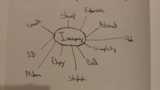
As you can see i wanted to think about possible topics and areas in which i could advance on in order to come up with some sort of theme. I am going to make a couple of mood boards as well just to expand on ideas, one will be for London Road Brighton and the other will be for the general theme of my posters/ leaflet.


As you can see i wanted to think about possible topics and areas in which i could advance on in order to come up with some sort of theme. I am going to make a couple of mood boards as well just to expand on ideas, one will be for London Road Brighton and the other will be for the general theme of my posters/ leaflet.
Poster And Leaflet Designer Research
I looked into existing Designers who have created poster and leaflets similar to that of what i want to create. As i started my research i came across a company called 'Sort Design'. These designers portrayed a very modern, colourful and detailed style through out their prints. Below are a few examples with my thoughts and comments...
Example One:


Example One:

As you can see from the image above the front cover of the leaflet is eye catching and stands out from the rest of graphics. The colours are bold and contrast. The text looks very modern and the font faces colors fits in with that of the leaflets style.
This is a close up of the front image on the leaflet. This looks 3D (three dimensional) and really stand outs do the the graphic design. I'd very much like to try and incorporate this idea into one of my own posters or leaflet.
Example Two:
The image above contains many graphic designed information leaflets and they all keep to the same theme. The theme is very simple yet very effective how they use the colour of the background and the colour os the text in order to create some sort of subtle contrast.
Again you see it here on the front cover the text colours only subtly change from lighter to darker against the red background colour. which in itself is a very powerful colour.
Here you see the first two images combined in order to see how it all looks when the information leaflets/ booklets are pieced together.
Example Three:
Very sleek and stylish design both in terms of colour and layout. The imagery used of the people is very powerful. Because the imagery is black and white this makes the rainbow colours stand out a lot more from the page, adds depth, detail and its very effective.
here we have the main logo close up. Connections being the name of the subject the leaflet is advertising to the reader. The rainbow is a nice touch in terms of colour, if the rainbow wasnt there it would be very dull.

Here you have two posters of Sort designs connections. Both poster contrast each other due to one of the posters having a black background and the other having a white background. However the main company symbol/ branding stays the same. The rainbow itself is slightly abstract as to the reason why its been placed/ coloured that way.
Research Into Existing Artists
The first Artist i looked at was Piet Mondrian. (1872 - 1944)
"Born in Amersfoot, Piet Mondrian began his study of art in 1989 as a student at Amsterdam's Risksakademie van Beeldende Kunsten. His landscapes are rendered in an impressionistic style but possess the marked vertical and horizontal lines/ tendencies that underpin his mature paintings".
http://www.pietmondrian.com/
Below are a few examples...
This image is very abstract and shows his vertical and horizontal lines and the simplicity.
Again like the first image i looked at keeping to the theme that Piet Mondrian preferred.
I like this image because i keeps the mature themed like the others however the the basic colours but fine details give it depth.

This image was like the other in the sense of the same imagery and graphic styles however this one is a bit more sketchy and colourful.
-
The second artist i looked at was Carmen Herrera (Born May 31st 1915)
Born in Havanna, Herrera was a contemporary of many abstract expressionist artists. Her works viewed in light of the time they were painted in, important milestones in evolution in the geometric minimalism movement. The following are examples of her work...

Very simplistic, very strong use of colours and the shapes are very abstract.

This is a contrast of opposites. It keeps to the theme of being abstract in terms of the shapes how ever the colour in this image is very contrasting and eye catching. the yellow in the background adds depth and comes away from the black and white.

Both Pieces of art in this image are both simple. the one of the right is very modern and fairly straight forward. opposite corners apart from the top one. the piece on the right again very simple and the colours are different thus the green contrasting on the white background.

This in itself is very striking. The yellow against the lack background is very powerful and eye catching. it adds depth and the priority of attention is focused on the yellow because its so prominent.
-
The Third Artist i looked at was Barnett Newman. (1905 - 1970)
"Barnett Newman was an American artist who is seen as one of the key figures of abstract expression in art. This is viewed through out his work".
http://en.wikipedia.org/wiki/Barnett_Newman
Some of his pieces are shown below as examples...

This is a very deep and interesting piece by Barnett Newman. The colours are very mature and modern and the use of white lining adds depth and detail. It gives the image a 3 tone effect, separating the image.

This image is very simplistic yet very bold. Abstract art doesn't always need to have a lot going on, and this is proof in itself.

This image is powerful, the red is very powerful as red can represent the most powerful of emotions. The white and black lines on either side contrast.

This image of abstract art is very dark, and the red streak going through the centre is emphasised because of the contrast.
Existing Urban Regernation Projects
I have looked into existing regeneration projects and looking at key points, i have listed the exmaples i have analysed...
The first regernation project i looked into was Brighton Marina.
http://www.brightonmarinaregeneration.co.uk/


The first regernation project i looked into was Brighton Marina.
http://www.brightonmarinaregeneration.co.uk/

Below are images taken of this project...
Brighton Marina Model View, 1974.
Brighton Marina Model View, 1974.
Custard Yard, Brighton.
The following Quote is from the website and it states what the intensions of the regeneration project were and what exactly he was trying to achieve at the end, the final out come.
"Brent Walker then bought the superstore. By the 1990’s they too went into administration which led to piecemeal development of further leisure facilities and residential accommodation. Then in 1998 Parkridge Developments bought the land and built the popular Waterfront and consulted with the local community on a master-plan for enhancement of Brighton Marina."
-
The next regeneration project i looked into was the eden regeneration project.
http://www.edenproject.com/whats-it-all-about/places-and-regeneration

Places and regeneration
The Eden Project is working on exciting projects across the globe that not only benefit the local environment but act as a focus for regional social and economic regeneration.
The above statement was on the eden projects website. The eden project is designed to regenerate the environment, social and economical values of the public world wide. The following image is a short list of some of the projects that the eden regeneration project has undertaken...
This list is also found on the website. There is Also a video on the website that is from youtube that you can watch here... http://www.youtube.com/watch?v=va87iu9hm4Y&feature=player_embedded
This video explains in more detail the sort of regeneration that the eden project under takes reaching out to people from further parts of society trying to get them involved with the things going on.
Subscribe to:
Comments (Atom)